
What are you going to do about that?
A “Blackhat.Design” is a UI intentionally designed to ‘trick’ people into making choices that benefit the company, but are (usually) bad for the customer.
In my work as a psychologist and conversion optimization specialist I help webshops implement these persuasion tactics in online marketing campaigns. But there is also an ethical responsibility to give the audiences of these organisations the tools to guard themselves against these techniques for when they are misused.
If you want a more elaborate introduction: Read this on Blackhat.Design first.
In this post, I’m going to give you 3 examples of common tactics to help you recognize them and make better choices. In other words: to give you some Counter Persuasion Tactics (CPT).
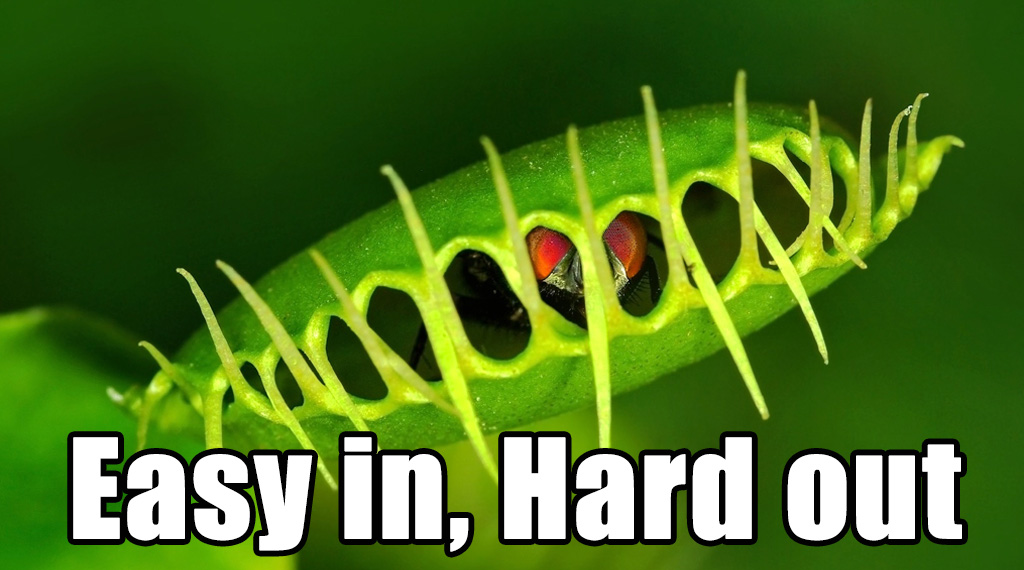
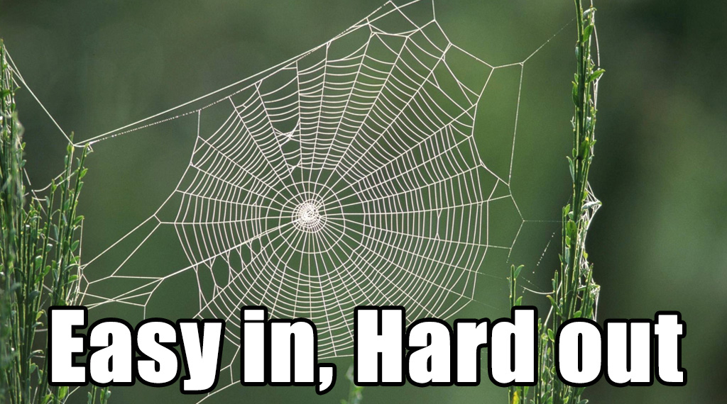
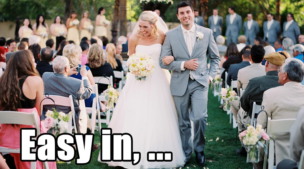
Easy too get in, hard to get out
One trick called ‘Roach Motel’ is to make it really easy to sign up for a commitment, but REALLY HARD to get out. Some examples from nature:
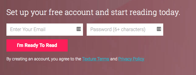
Take Texture, selling digital magazine subscriptions. This is all you need to sign up:
So far so good. Now let’s see what it takes to unsubscribe:
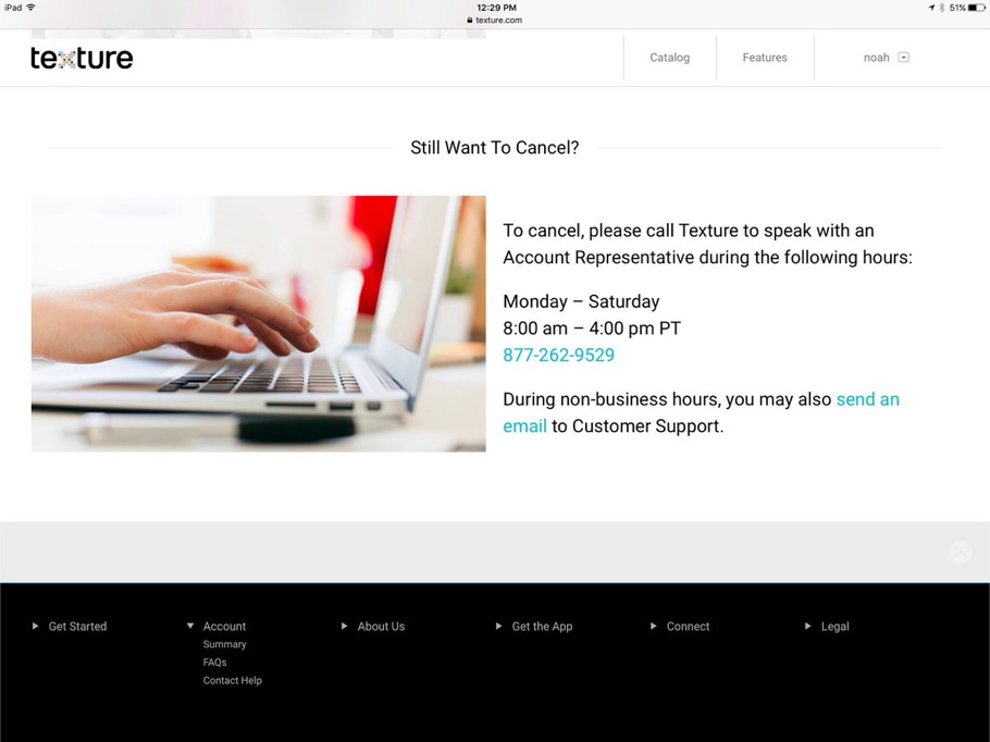
Really? I wonder why they didn’t go with the morsecode option…
There is no technological reason to not make unsubscribing just as easy as signing up. This is pure evil to keep people subscribed.
Limited rooms available (Scarcity)
When there is not much left of something, we want it even more.
Originally Dutch booking site Booking.com got called back by a judge for mis/overusing this tactic.
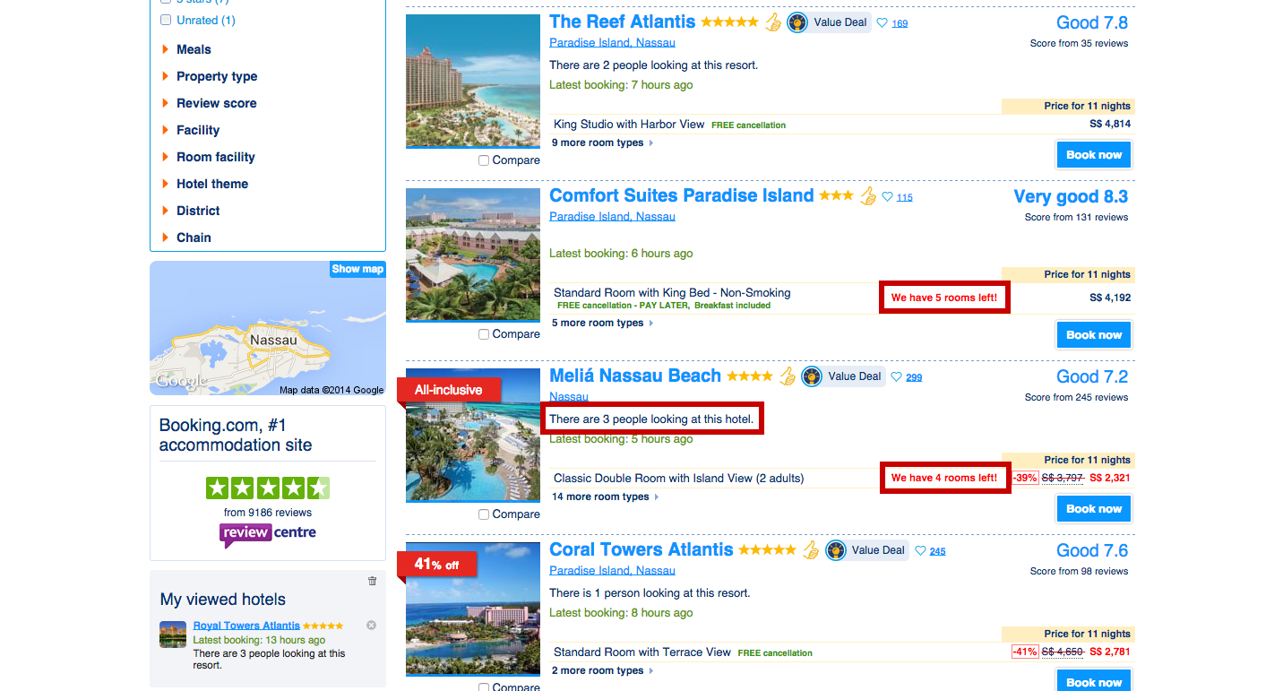
Sentences like “Only 2 rooms left” make you think that there are only 2 rooms left in the whole hotel, while it just meant that there were only 2 rooms left on booking.com (that day…). If you’d call the hotel, you might find out that a lot more rooms were actually available.
Hiding important information
At Euroflorist some of our usability research showed that users could hardly find the delivery fee and when they did said it came across untrustworthy as it looked like we were hiding it:
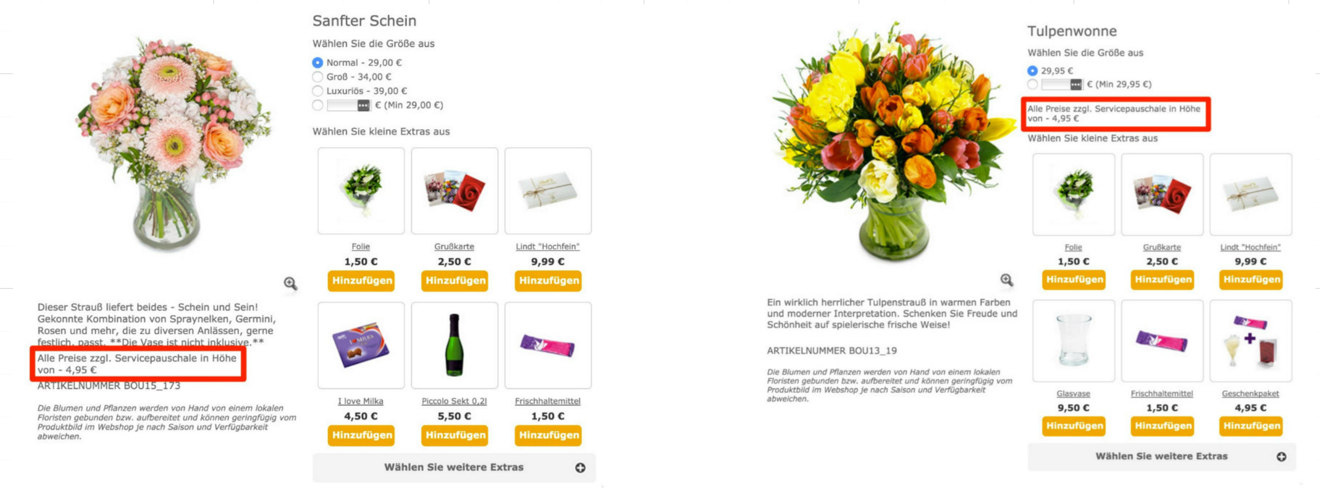
Original on the left, improved version on the right.
(Technically not a Blackhat.Design because it wasn’t intentional in our case, but a lot of companies try to hide information in the fine print that they think might not be beneficial for the purchase.)
Not coming across as trustworthy is not a good long-term strategy. In this case, it’s even a very bad short-term strategy: the version on the right (where the delivery fee was placed directly below the product price) had a conversion rate increase of over 12%.
Want more Counter Persuasion Tactics?
Subscribe to blackhat.design, I’ll be posting more next year, including an overall defence plan you can use for you next big purchase! (: